Intro
Deliverables:
Visual Identity
Graphic Design
Design Elements
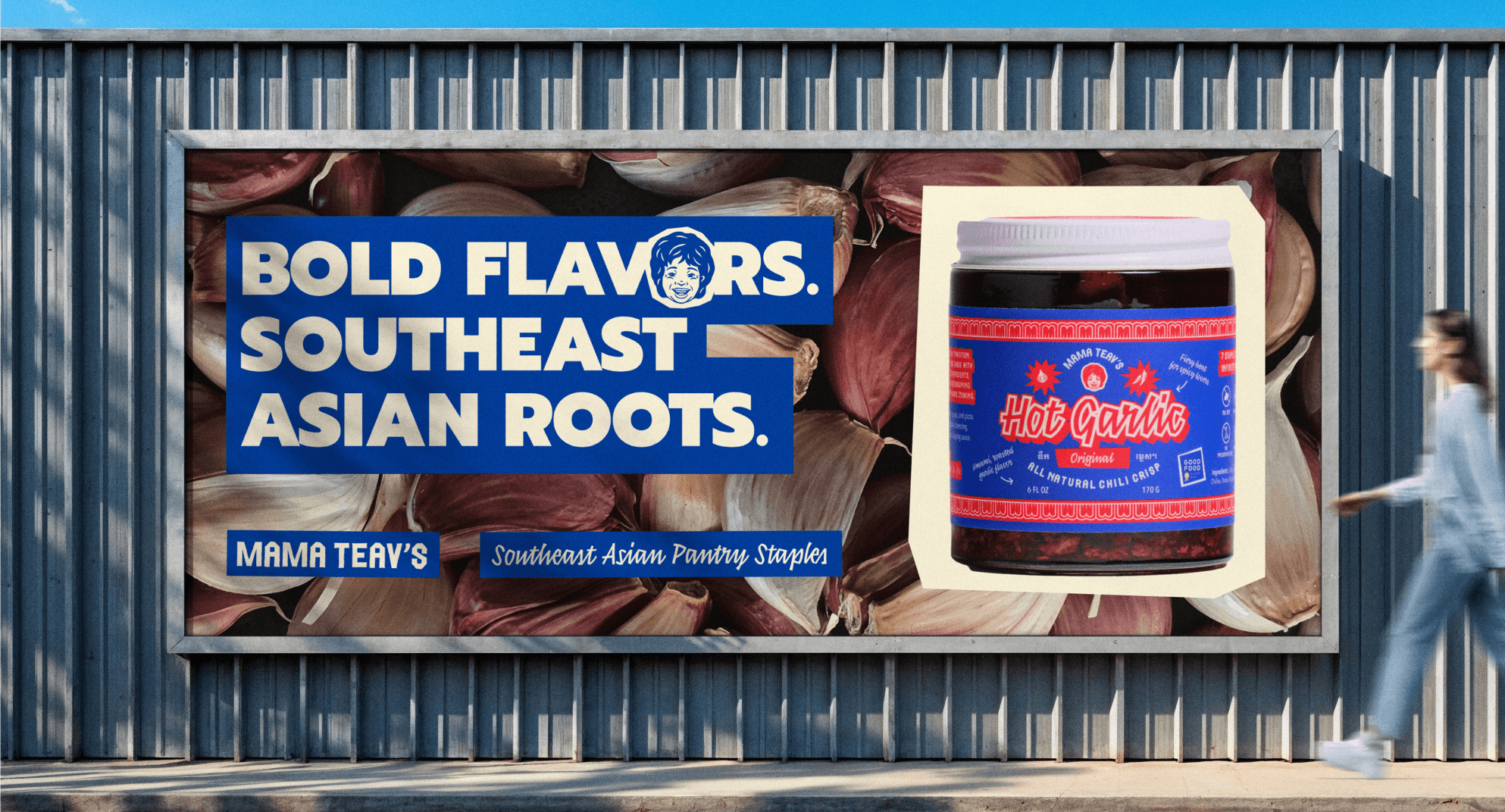
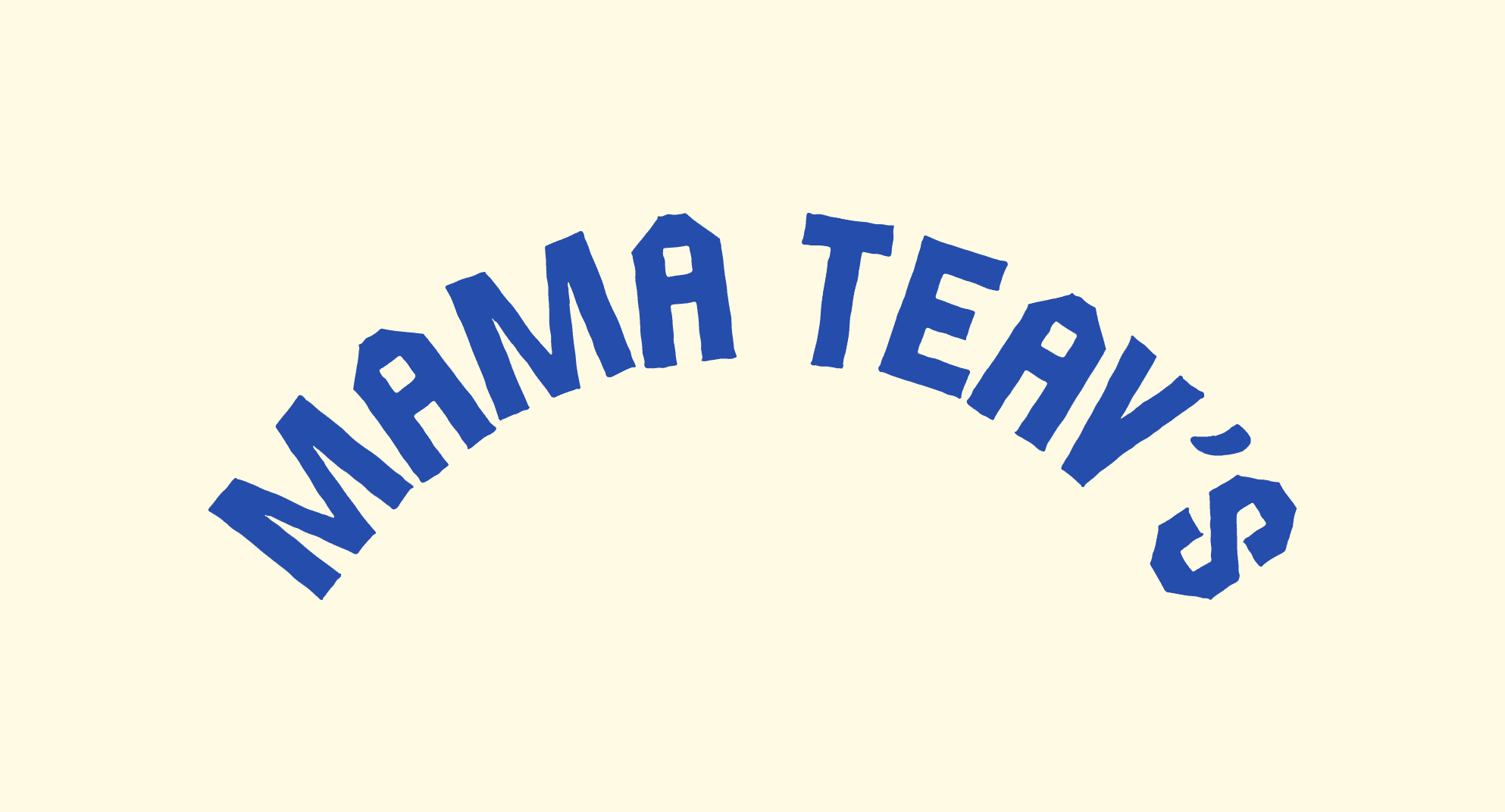
With a new strategic positioning and refreshed packaging on the horizon, Mama Teav’s—a Southeast Asian American pantry brand rooted in family tradition—needed an updated set of brand guidelines and an expanded visual identity. Working from their foundational logos, colors, and typography, I developed a scalable design system to support the needs of their growing business.
The resulting brand guidelines introduce expanded logo marks, a refined color palette, and flexible packaging templates designed for future product drops. Every asset anchors back to their core mission: celebrating bold, extroverted flavors and serving as a gateway to Southeast Asian culinary culture with simple and whole ingredients.
Role: Creative Direction / Designer
Packaging: Garnish Studios
Strategy: Mel Kenny

Product Labels
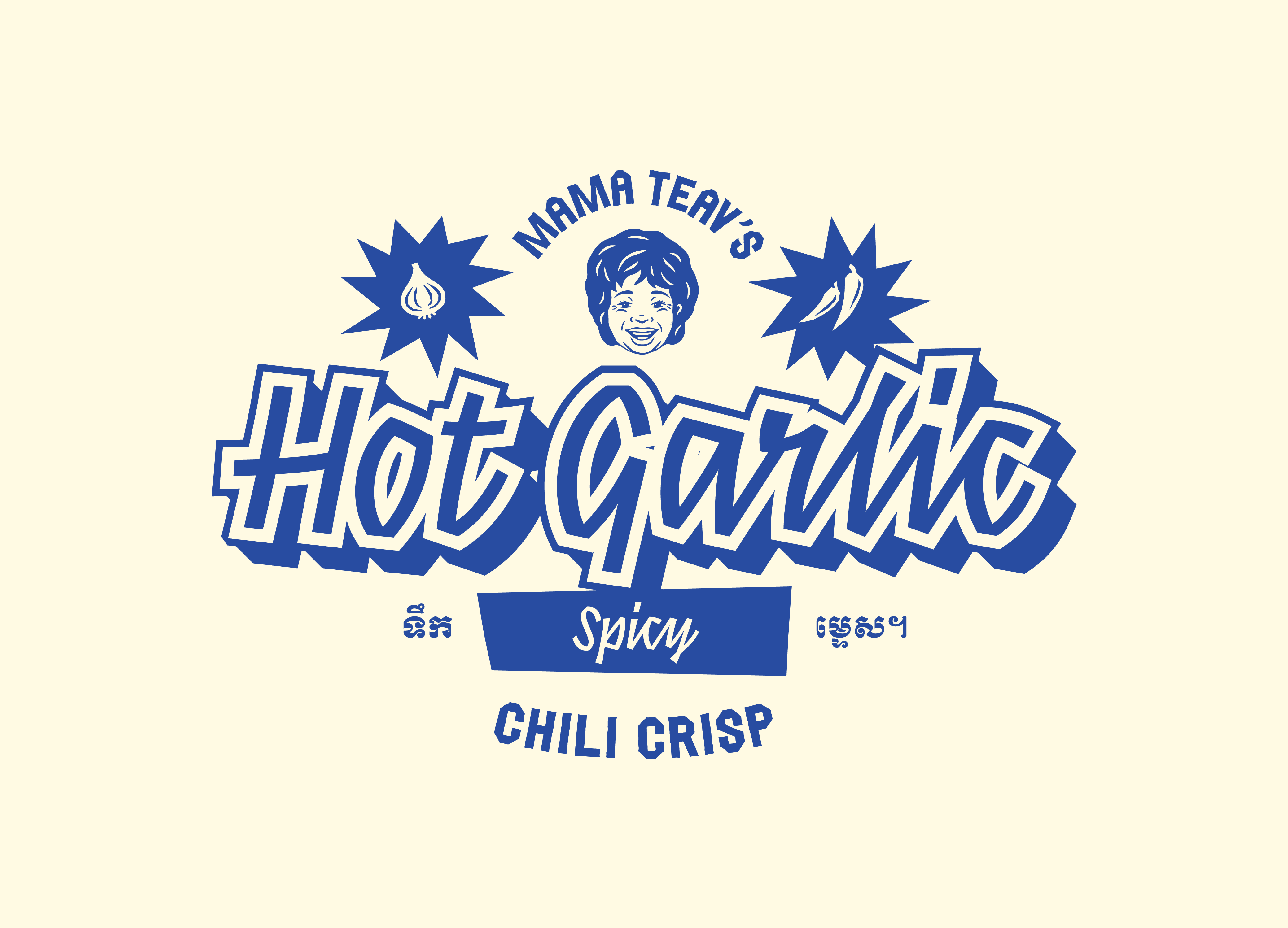
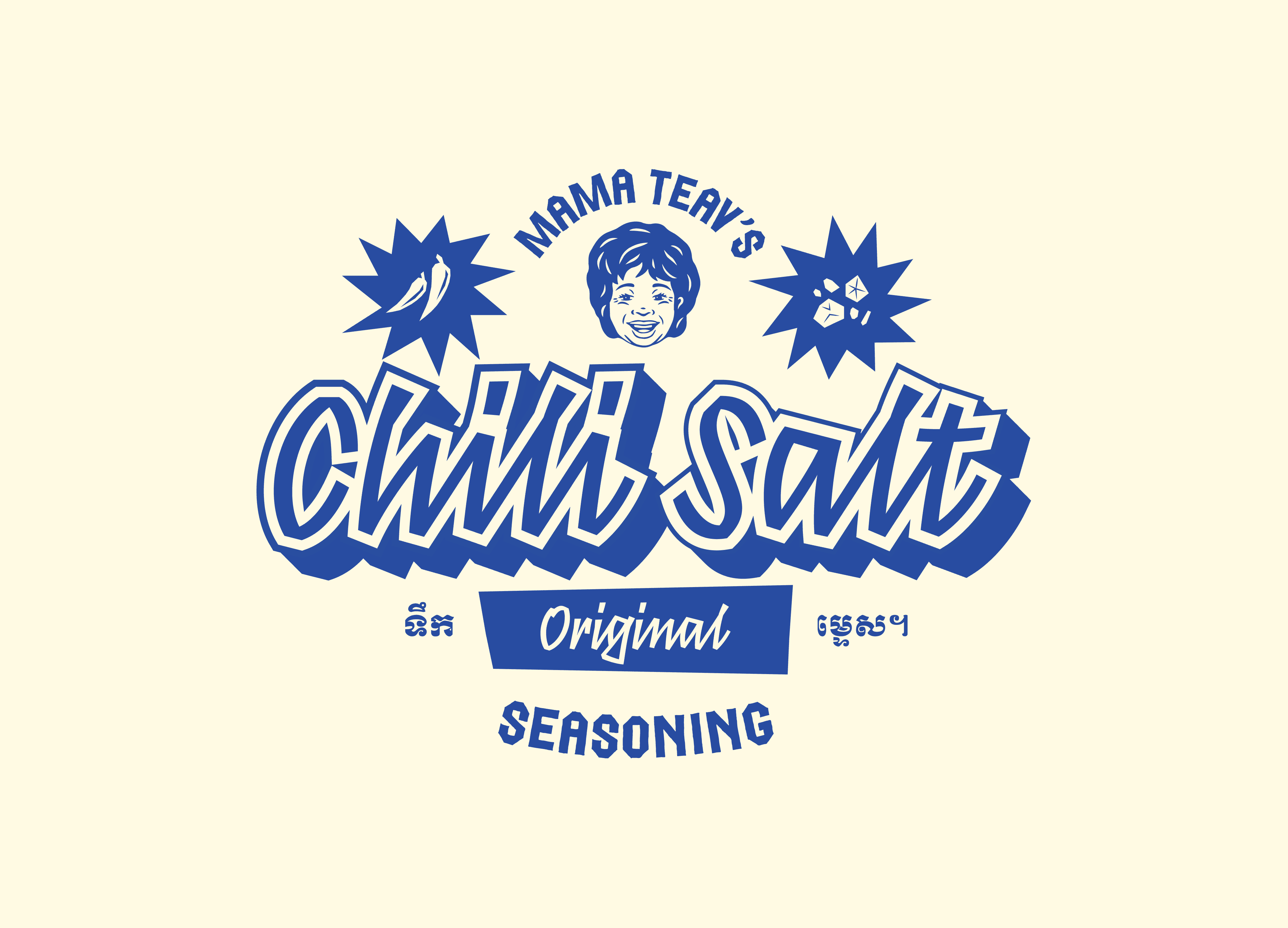
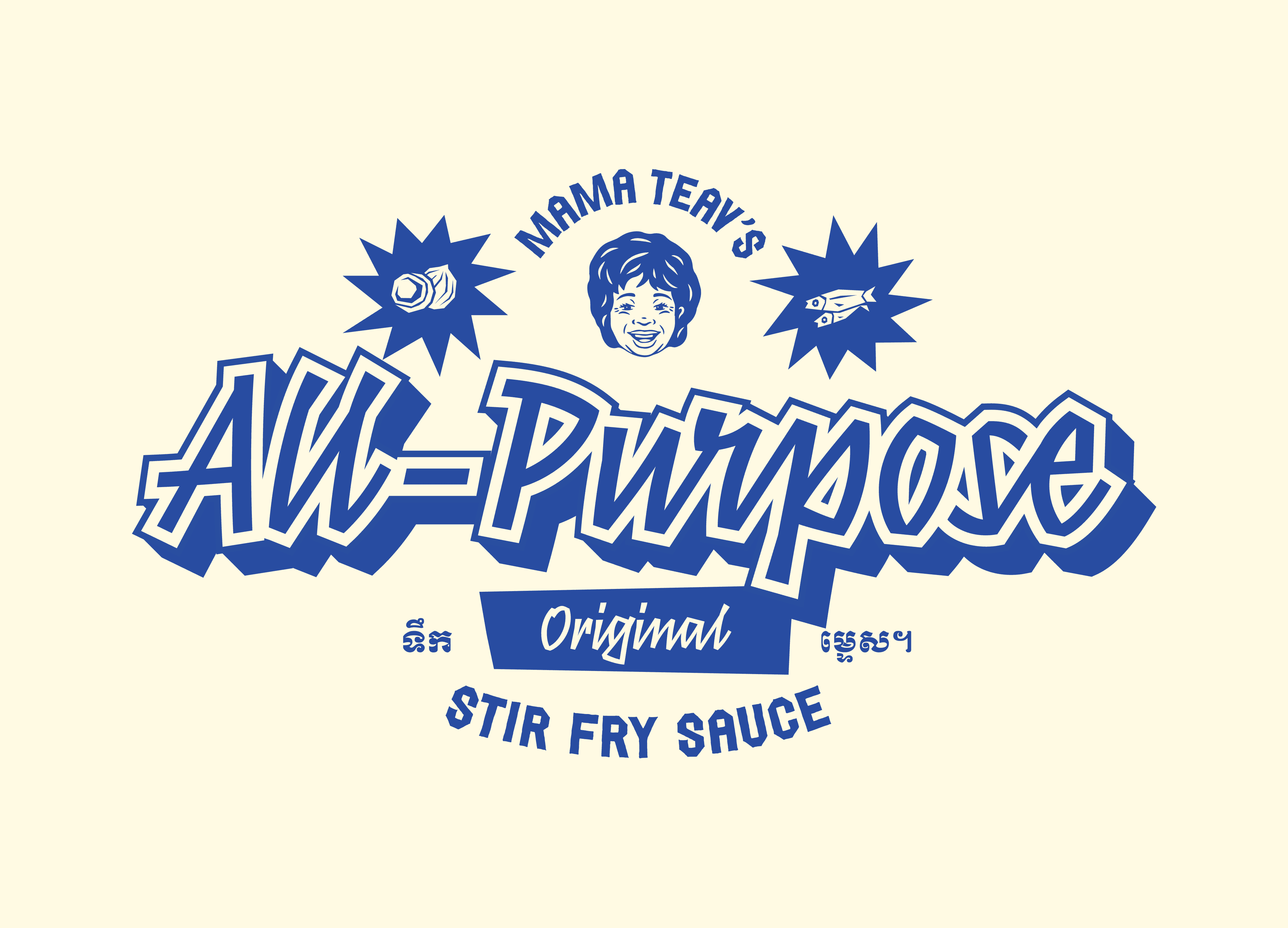
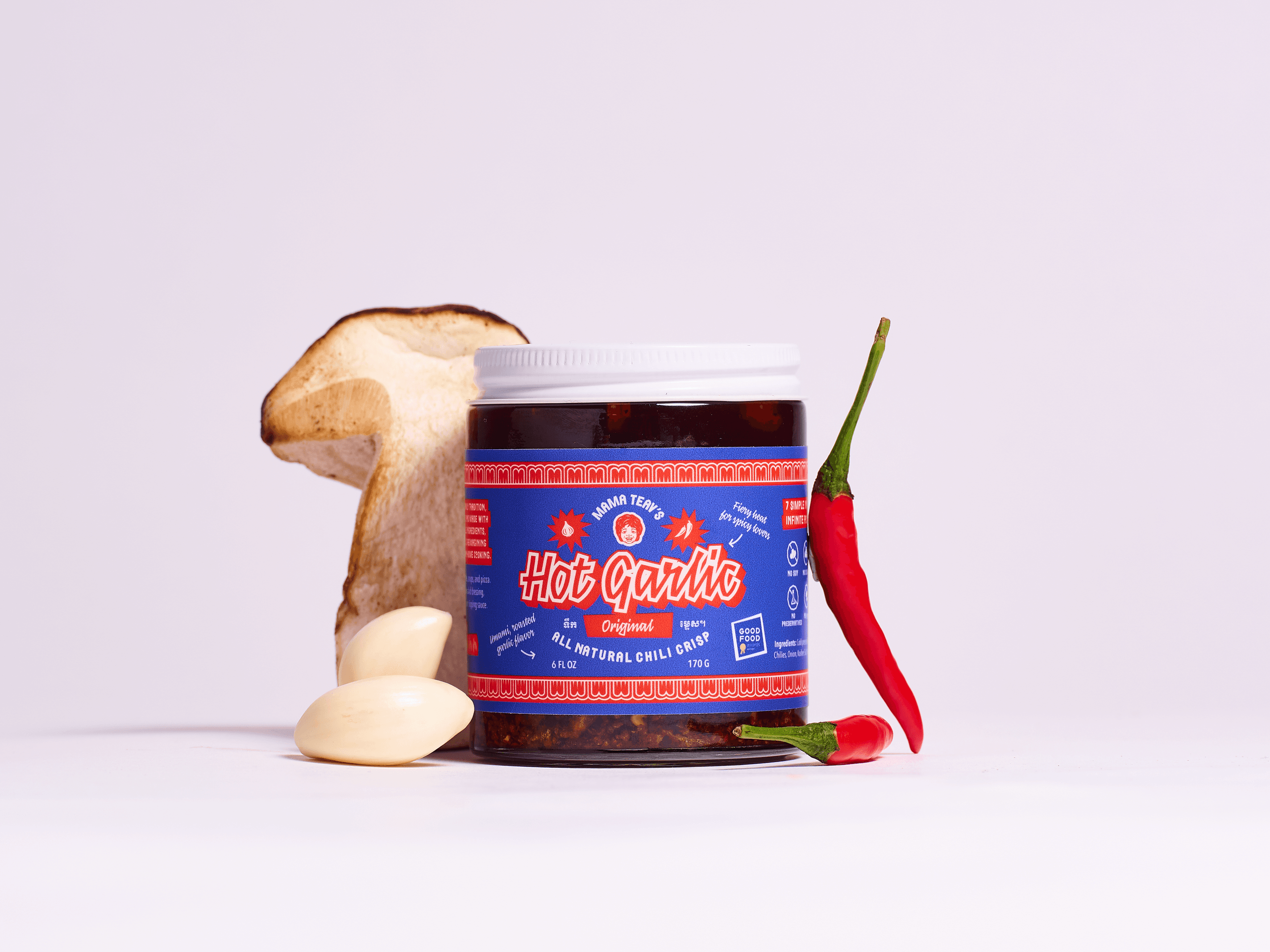
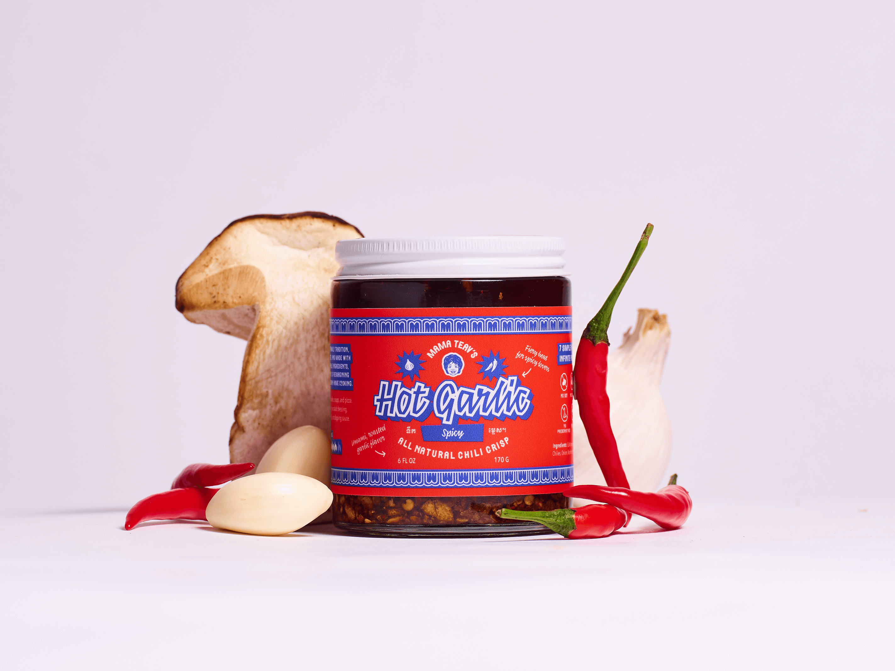
As the brand shifted its positioning from a single-product focus to a comprehensive line of Southeast Asian kitchen staples, the goal was to anticipate future releases and develop a scalable packaging template system. Under this new framework, individual product icons can be seamlessly swapped out, and new product names receive the same typographic treatment as the core line, while flavor profiles are easily differentiated through distinct color hues.

Rooted in Southeast Asian hertiage
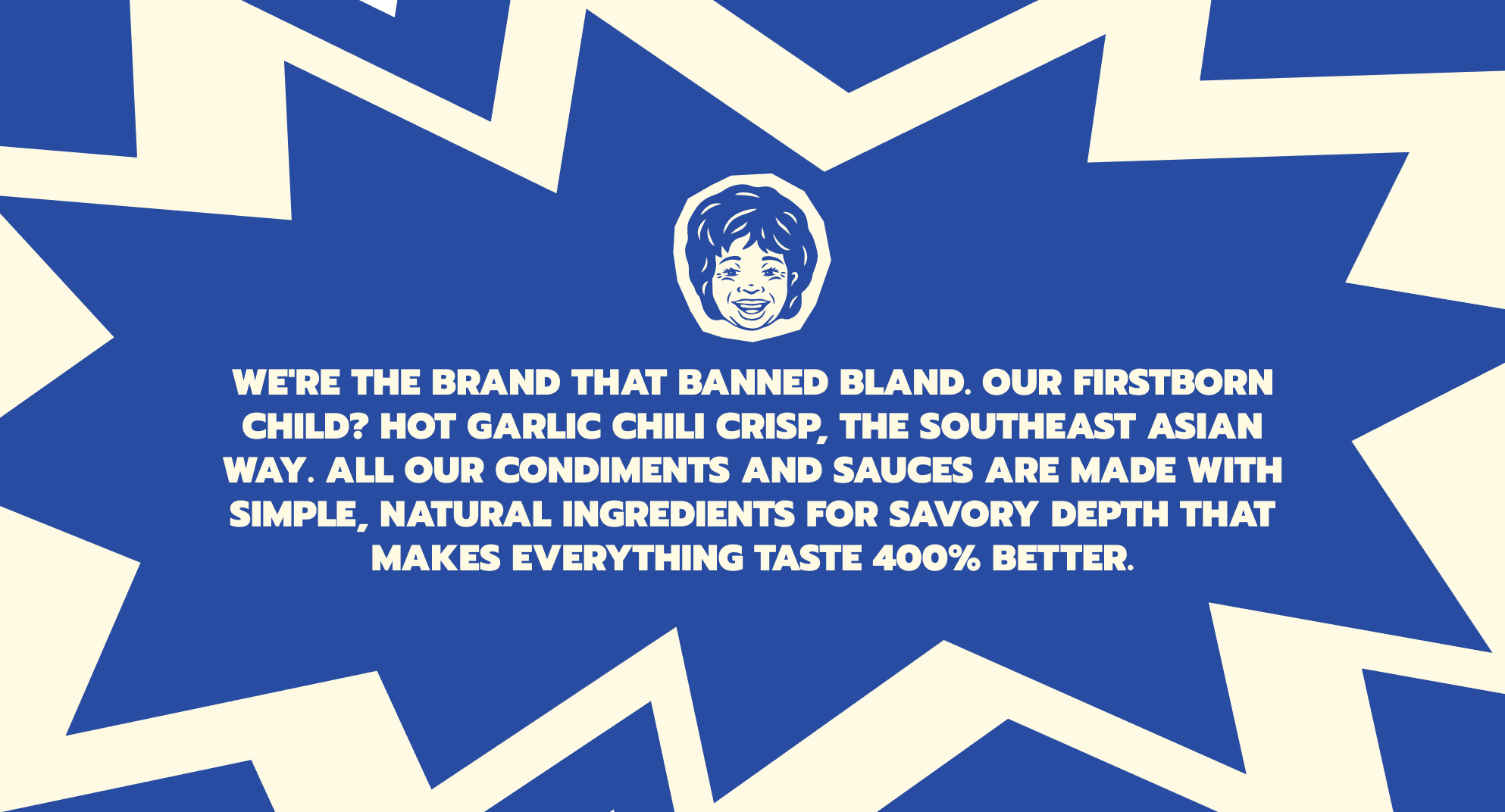
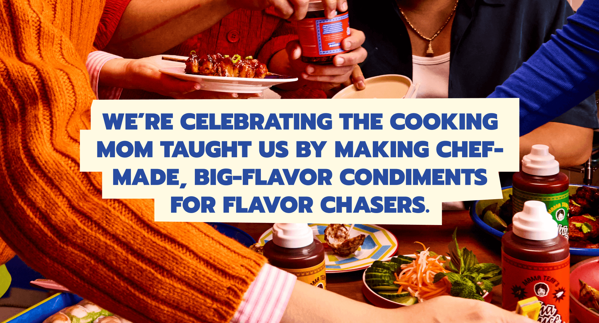
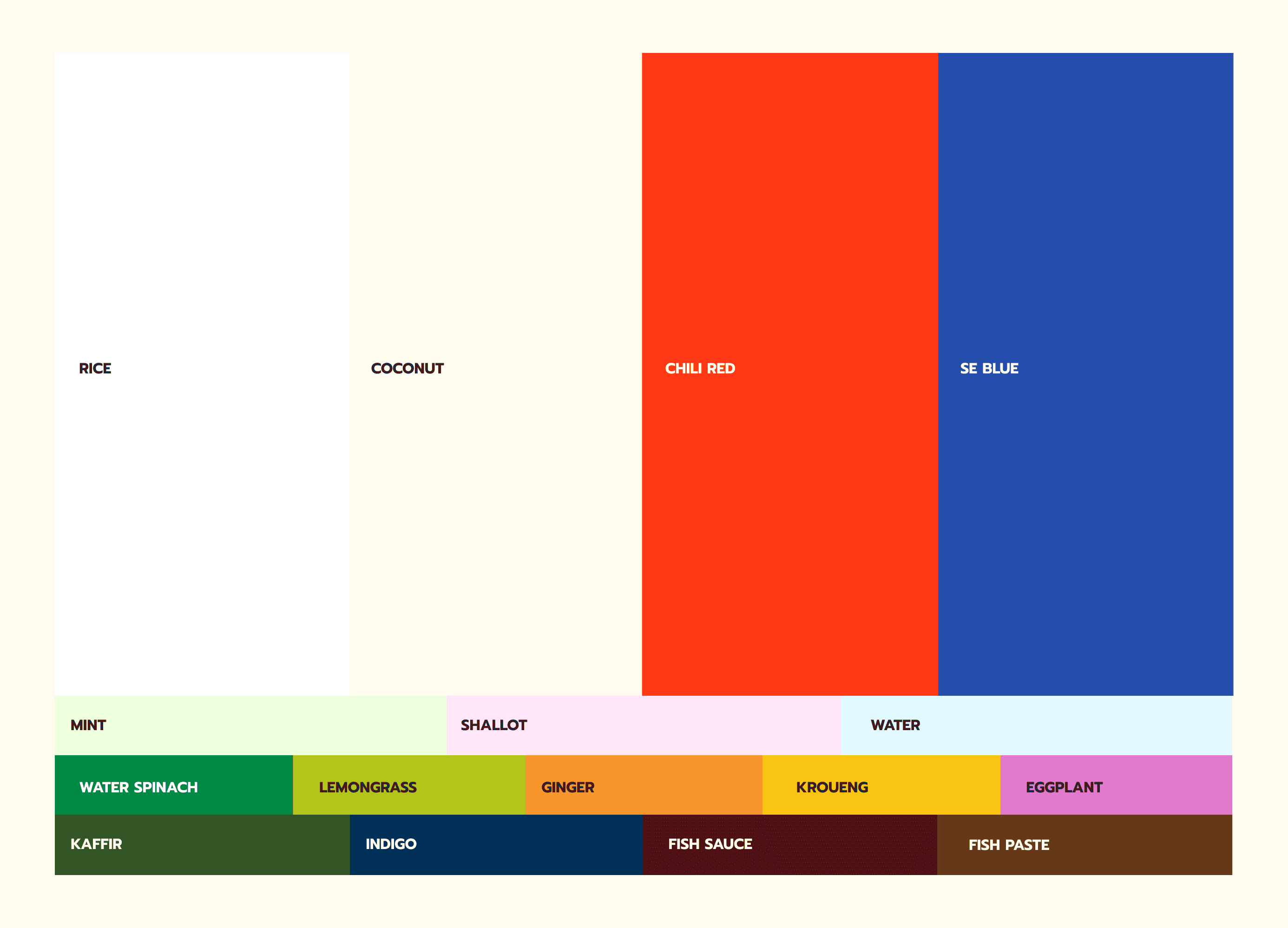
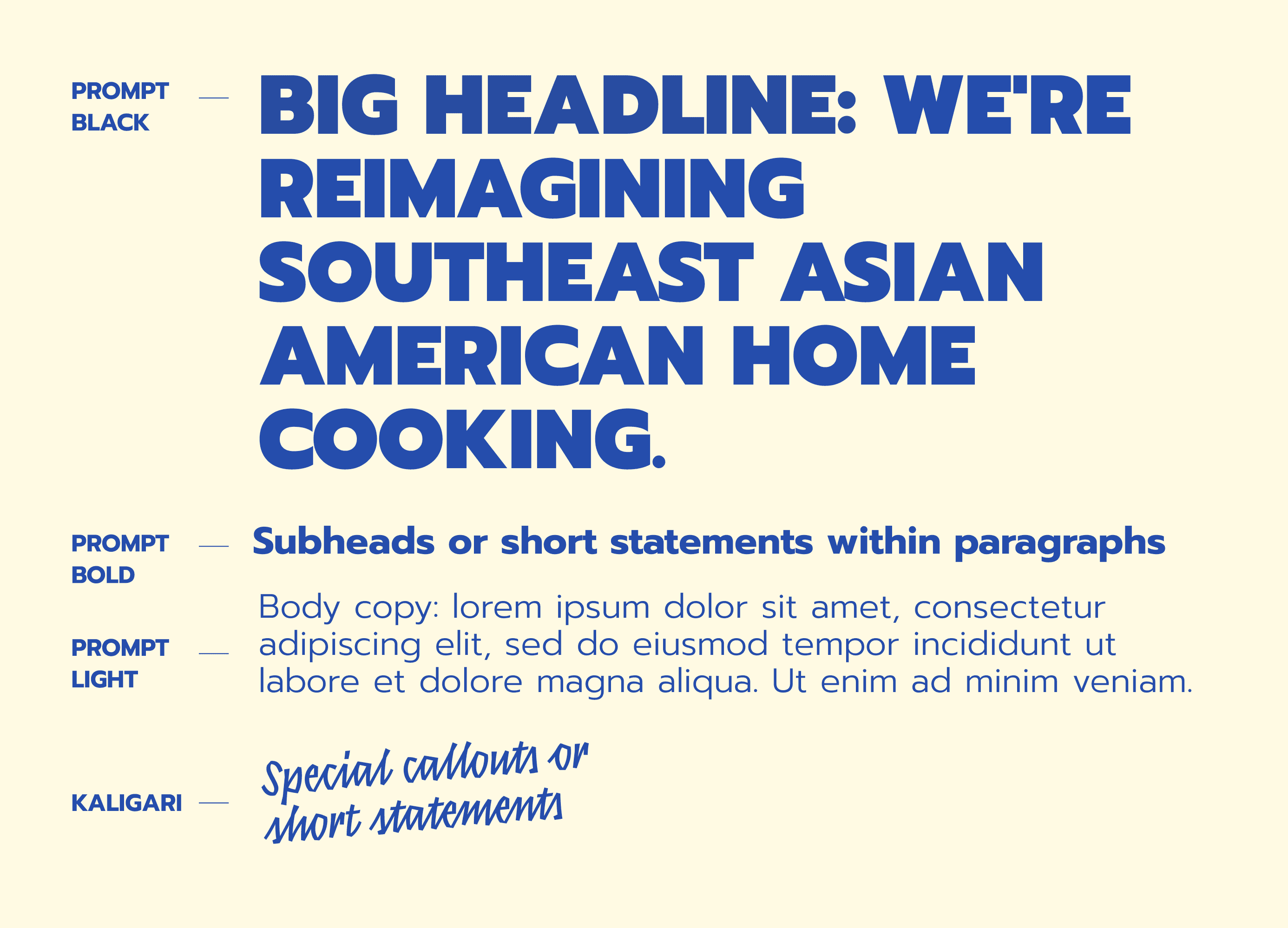
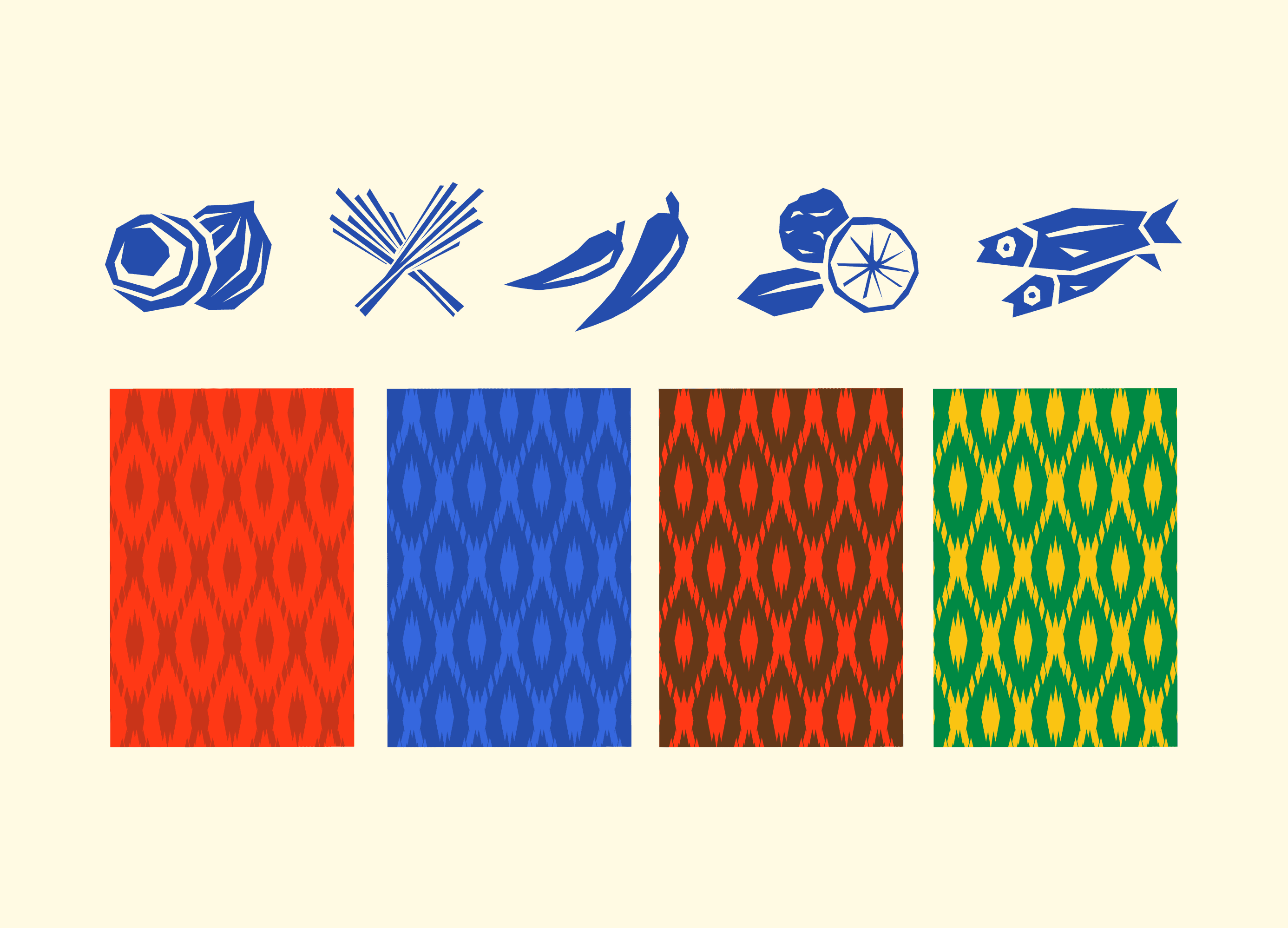
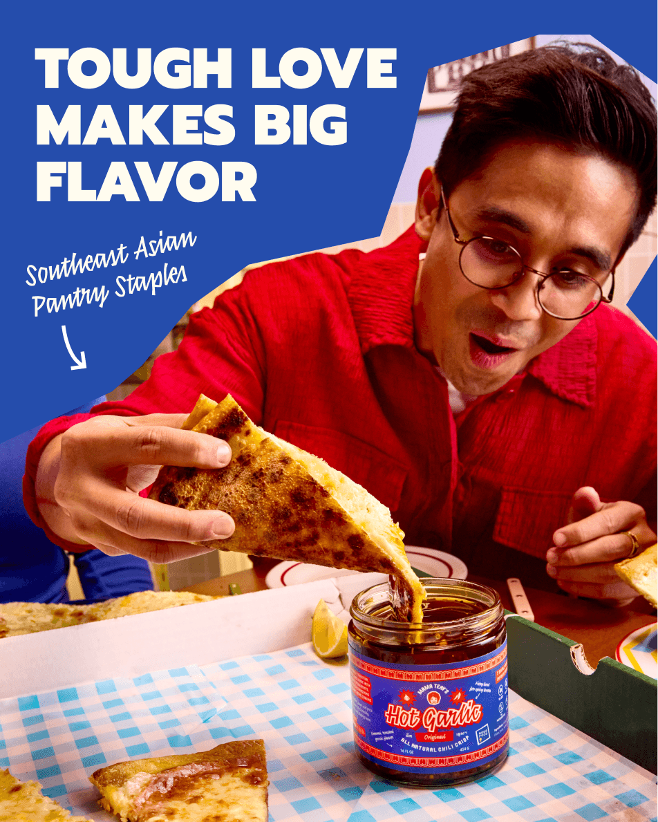
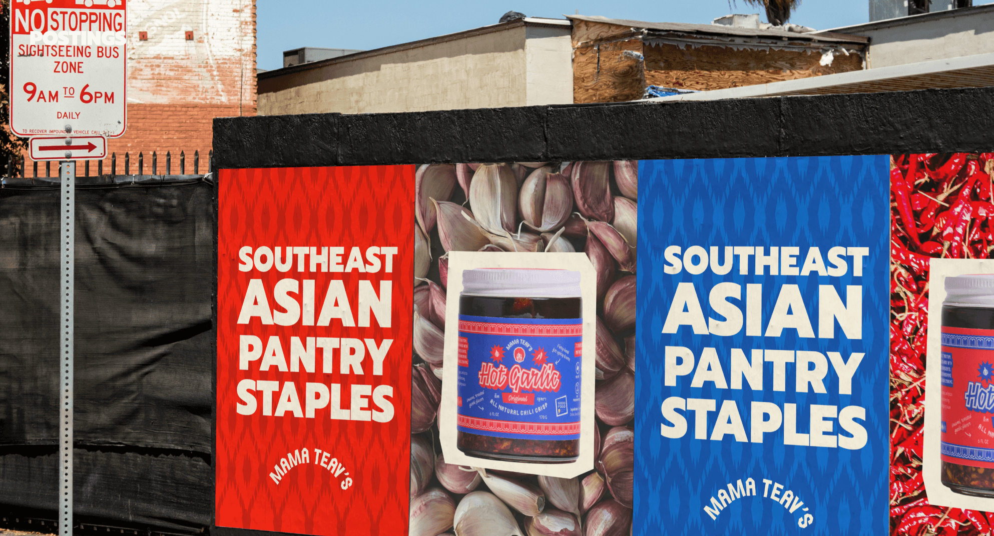
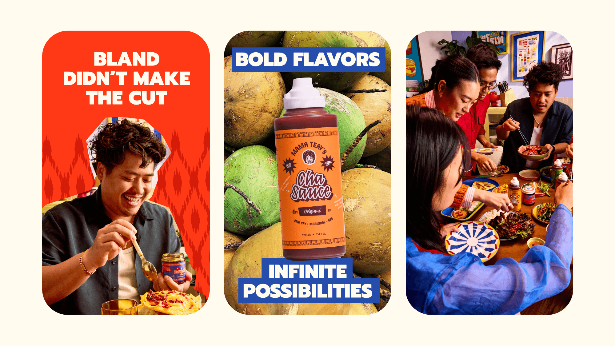
From an expanded color palette inspired by the region's essential ingredients to a typeface rooted in Thai typographic letterforms, every detail tells a story. By weaving in cultural icons like the stone structures of Angkor Wat, traditional textile patterns, and photography that captures the fiery, loving personalities of immigrant households, the entire visual identity honors its heritage while looking confidently forward.
Coming together
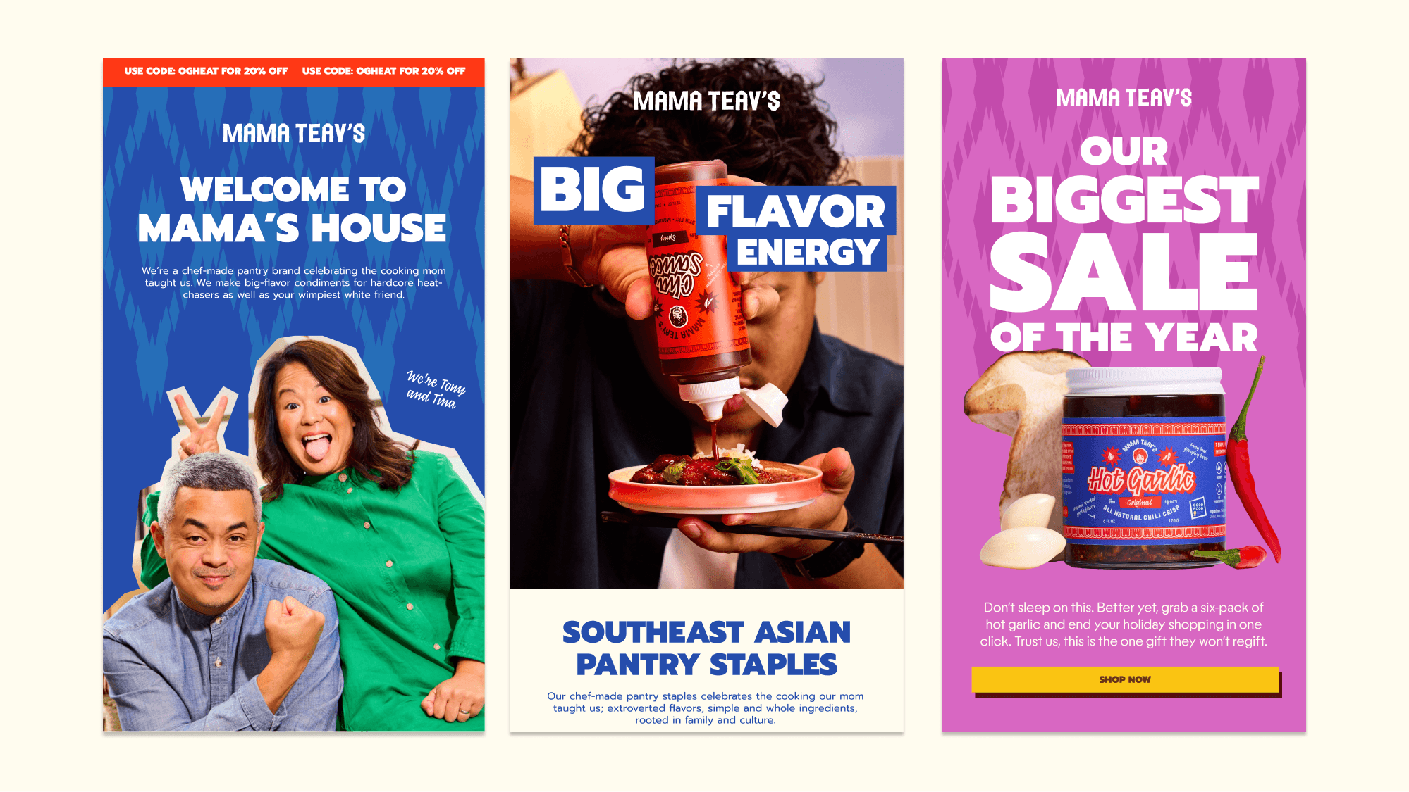
Embracing an unapologetically Southeast Asian narrative, the visual language utilizes collage, tactile layering, and sharp cutouts to bring the brand's personality to life. Mirroring the chaos and craft of the kitchen, this design system treats typography, color, and graphics as a flexible set of "ingredients"—allowing elements to be turned up for maximum spice or dialed back for simplicity. This modular approach ensures the identity remains dynamic and adaptable, seamlessly shifting from bold and expressive to quiet and refined.
Next work